AWS Organizations

Turning account structure into a shared, consistent primitive for any AWS service to build on.
Dec 2023 – Jul 2024
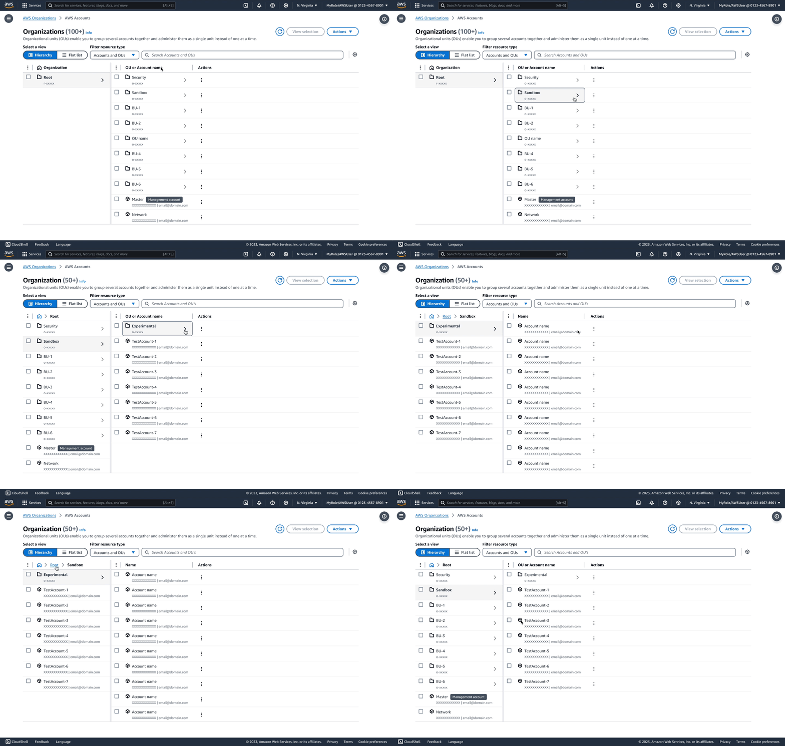
A screen recording of the Organizations component: the Root column on the left, the organizational units and accounts under it on the right — Security, Sandbox, a run of business units, then the Master and Network accounts — each row with a disclosure arrow and an actions menu, under a Hierarchy and Flat list view switch.

Opportunity

AWS Organizations lets enterprises manage thousands of accounts as a hierarchy of roots, organizational units, and accounts. By 2022, a shared Organizations component exposed that hierarchy inside 12 AWS service consoles. It had become a platform primitive: every improvement could propagate across services, but so could every limitation.
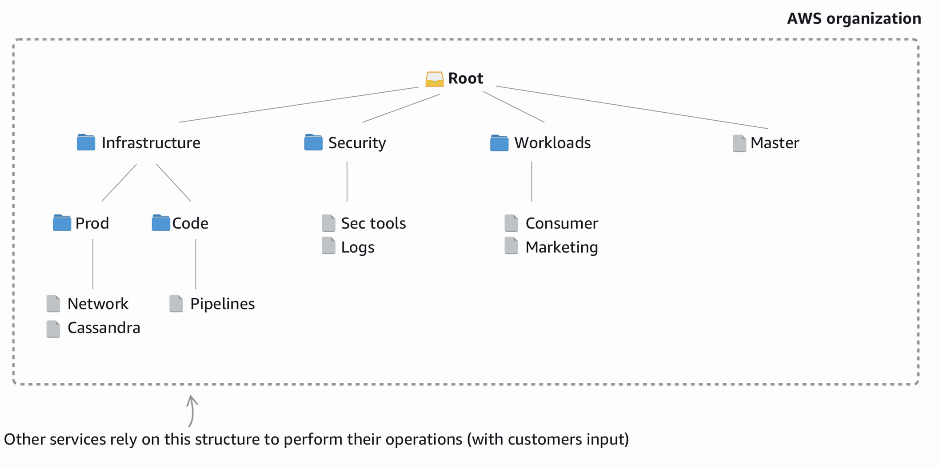
An AWS organization drawn as a tree inside a dashed boundary. Root branches to Infrastructure, Security, Workloads and the Master account. Infrastructure holds the Prod and Code organizational units, which hold the Network, Cassandra and Pipelines accounts; Security holds Sec tools and Logs; Workloads holds Consumer and Marketing. An arrow into the boundary from below is labelled “Other services rely on this structure to perform their operations (with customers input)”.
An AWS organization structured as a hierarchy of organizational units and accounts.

Organizations administrators used the hierarchy to add and group accounts. Delegated administrators then relied on that same structure inside other AWS services to manage security, compliance, backups, access, and other operations.
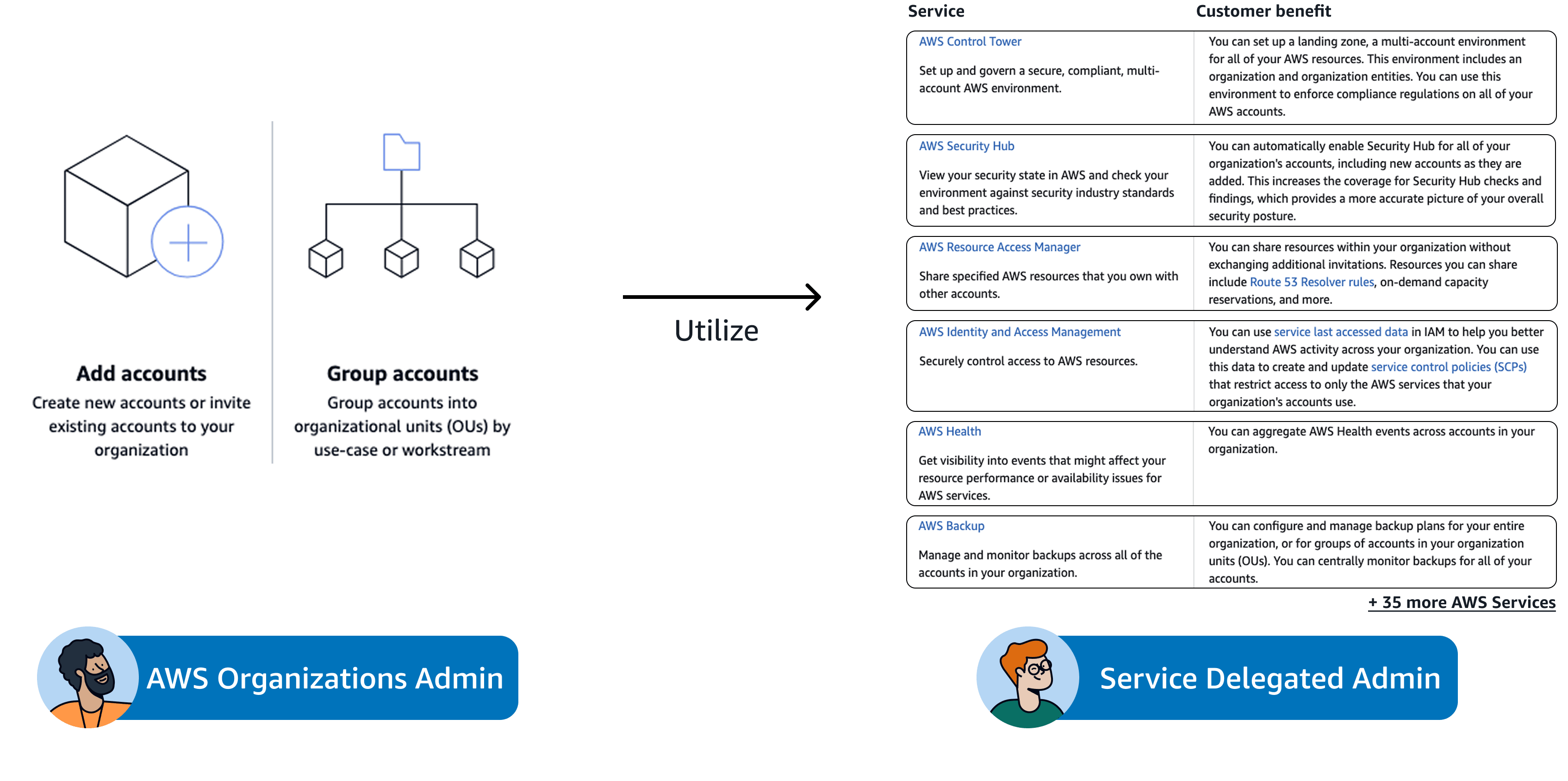
Two personas side by side. On the left, AWS Organizations Admin, over two cards: Add accounts — create new accounts or invite existing accounts to your organization — and Group accounts — group accounts into organizational units by use-case or workstream. An arrow labelled Utilize runs right to Service Delegated Admin, over a table of services and their customer benefit: Control Tower for a governed multi-account landing zone, Security Hub enabled across every account, Resource Access Manager for sharing without invitations, Identity and Access Management for service control policies, Health for events aggregated across accounts, and Backup for organization-wide backup plans, closing on a line reading + 35 more AWS Services.
Organizations administrators create the structure; delegated administrators use it to perform service-specific work.

The existing component was a single indented tree with one metadata column. As the supported scale increased from 5,000 to 50,000 accounts, its limitations became critical: navigating deep levels was difficult, context disappeared, filtering and sorting were limited, and bulk selection could not support large operational tasks.

The opportunity was to redesign this shared primitive for ten times the scale while supporting very different service workflows. Every decision was a platform decision because 12 consoles would inherit it—and more were waiting.

Discovery & Strategy

I mapped service needs across two dimensions: how much surface area the component occupied and what users needed to accomplish with it.

The integrations fell into three footprints:
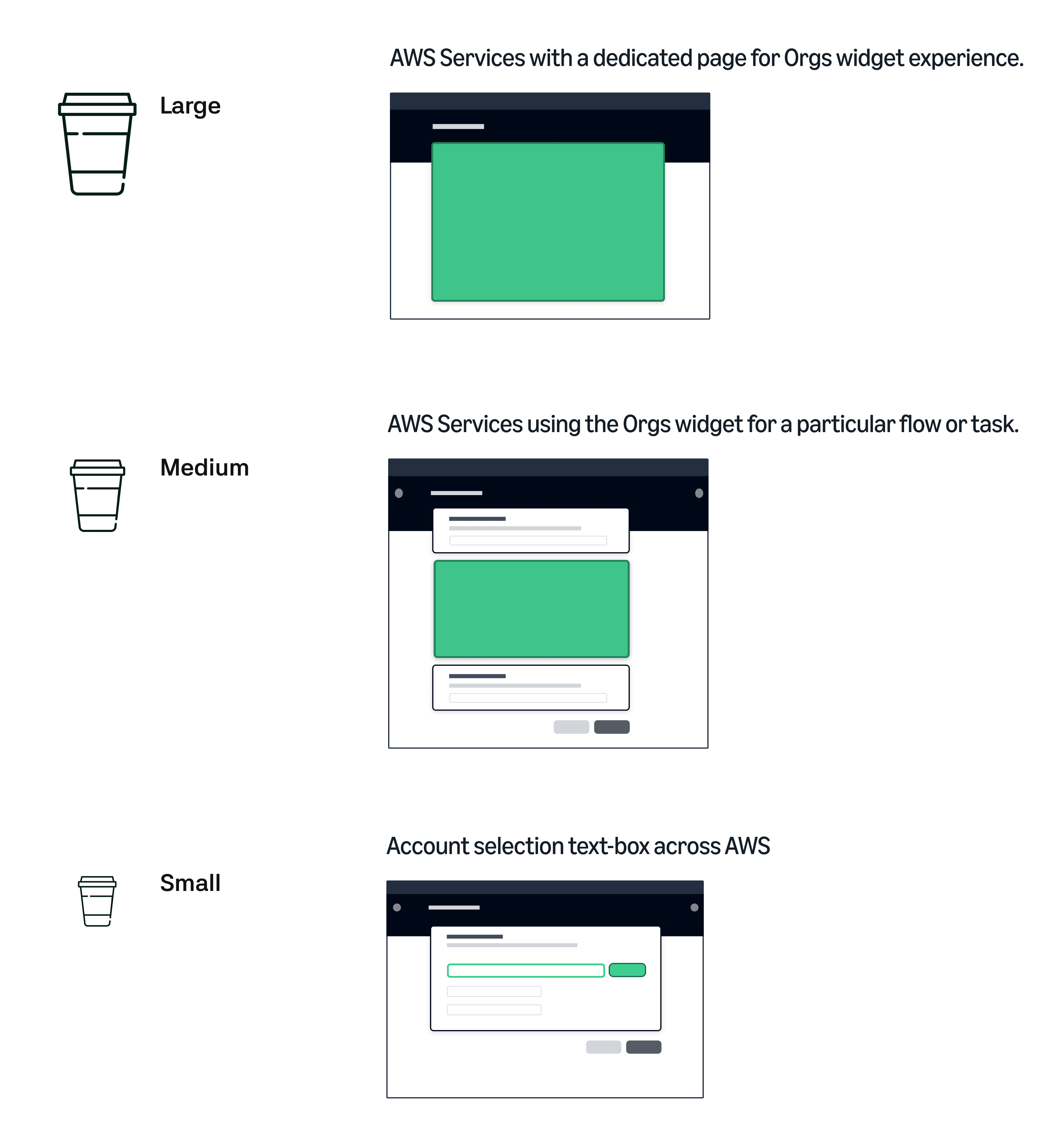
  • Large: a dedicated page where exploring the organization was the primary task
  • Medium: the hierarchy embedded inside a larger service workflow
  • Small: a compact field for selecting an account
Three service size categories drawn as coffee cup sizes, each beside a wireframe browser window with the Organizations experience shaded green. Large — AWS services with a dedicated page for the Orgs widget experience — fills almost the whole window. Medium — AWS services using the Orgs widget for a particular flow or task — is a panel sitting between two form cards. Small — account selection text-box across AWS — is a single field on one row of a short form.
Service integrations grouped by how much of the console the Organizations experience occupied.

Across those footprints, three jobs remained consistent:
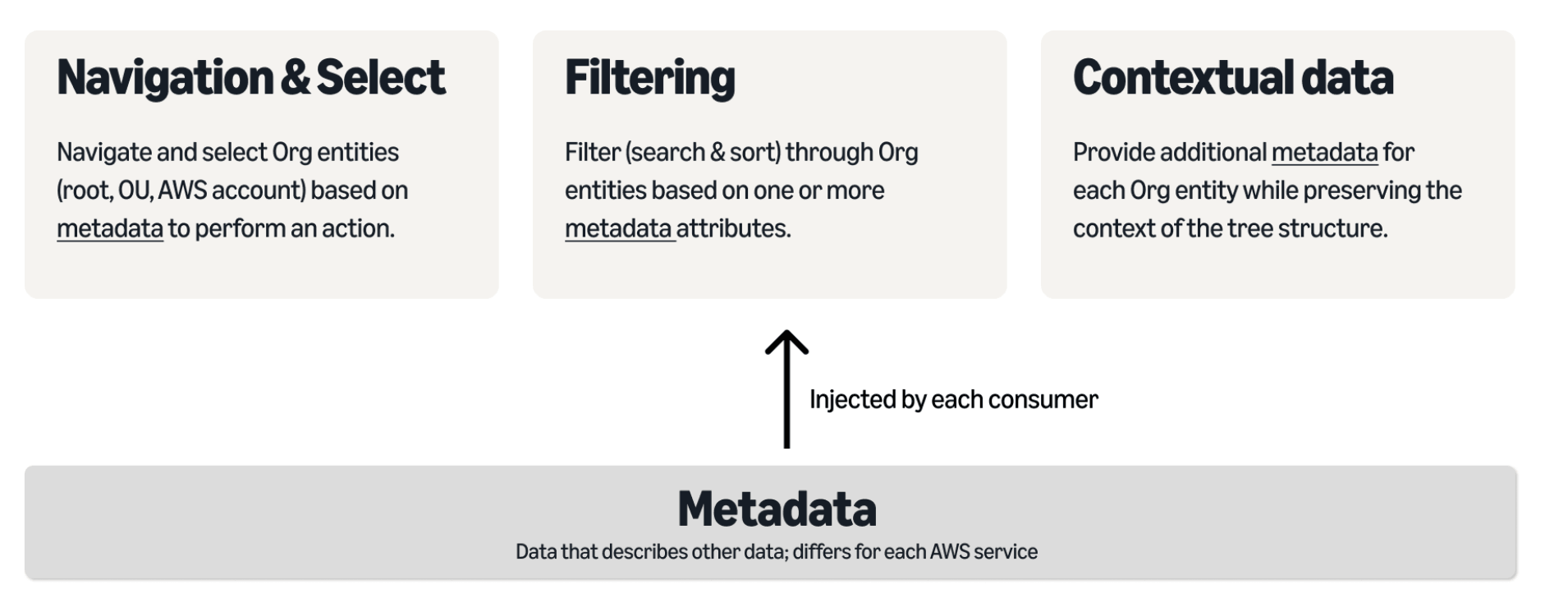
  • Navigate and select roots, organizational units, and accounts for an action
  • Filter, search, and sort entities using one or more attributes
  • Read additional context without losing the entity’s place in the hierarchy
Three use-case cards, navigation and select, filtering, and contextual data, all fed by an arrow from a metadata bar labelled as data injected by each consumer.
Three jobs—navigate and select, filter, and add contextual data without losing the tree.

That context differed by service. Control Tower needed compliance status beside each entity; another service might need security or backup metadata. The component could not own all of it. This led to a clear platform contract: AWS Organizations owned the hierarchy and interaction model, while each hosting service supplied its own metadata and actions.

Designing the Experience

Miller columns for deep-tree wayfinding

Cloudscape’s default pattern for hierarchical data was a related table. I chose Miller columns instead—a deliberate exception that had to be justified through the customer tasks.

Selecting an organizational unit opens its children in the adjacent column, keeping the parent path visible as users move deeper. The pattern supported arbitrary depth without turning the experience into one enormous indented tree. A flat view remained available for scanning, sorting, and searching across the entire organization.

This combination addressed the core scaling problems: preserving context between levels, navigating large hierarchies, and supporting selection across nested entities without flattening the structure.
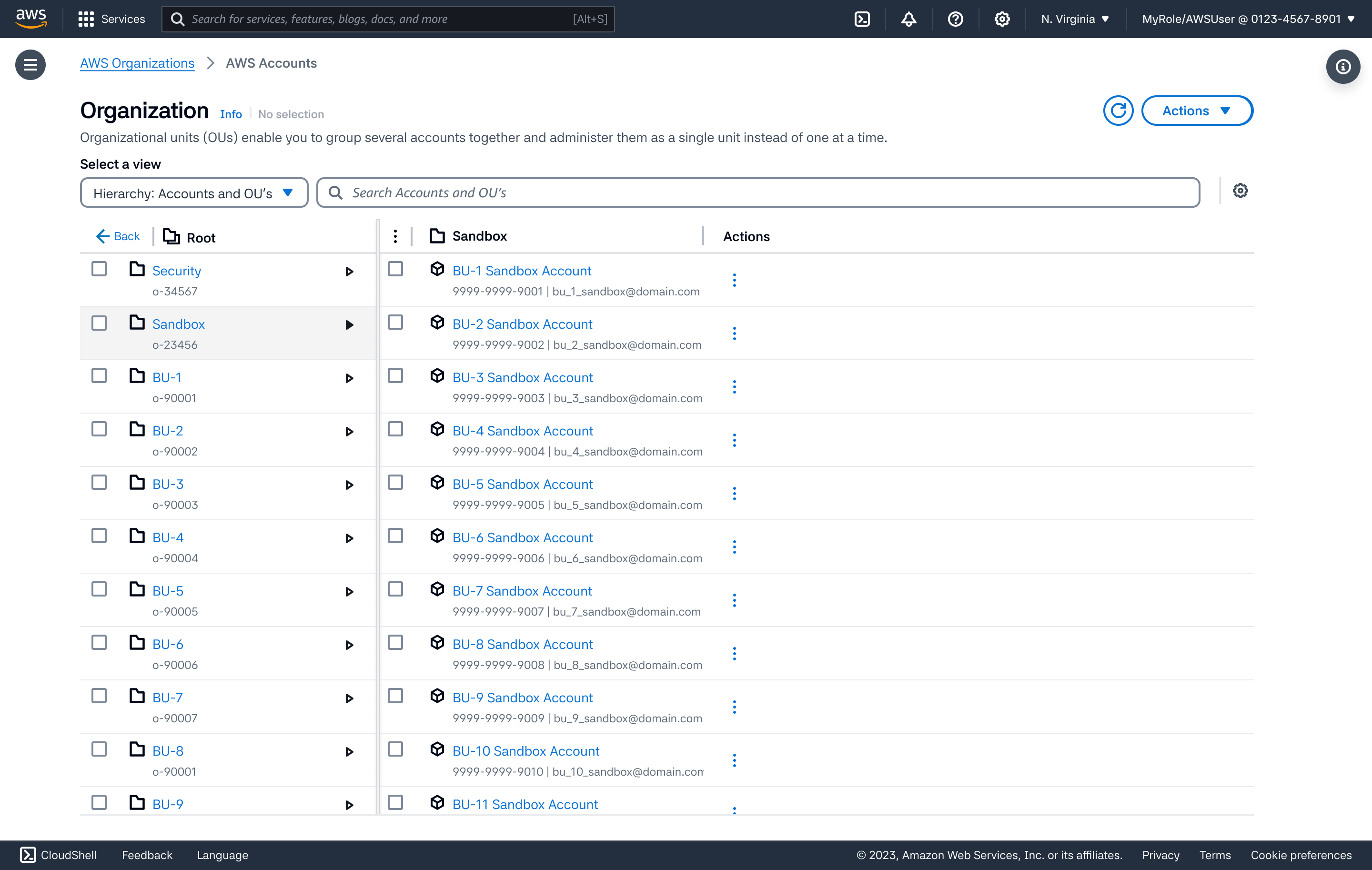
The redesigned component in two columns. The left column lists the organizational units under Root — Security, Sandbox and a run of business units, each with its organization ID and a disclosure triangle — with Sandbox highlighted as the selected parent and a Back link above. The right column is headed Sandbox and lists its accounts, BU-1 through BU-11 Sandbox Account, each with an account number, an email and an actions menu. Above both sit a Hierarchy: Accounts and OU's view selector and a search field.
The Miller-column redesign: a two-column layout that keeps the parent in view while you drill into its children, built to remain navigable across as many as 50,000 accounts.

Service context without service-specific forks

Hosting services could inject metadata through additional columns or a split-panel detail view. The shared component handled hierarchy navigation, searching, sorting, column behavior, and selection, while each service supplied the context its customers needed.

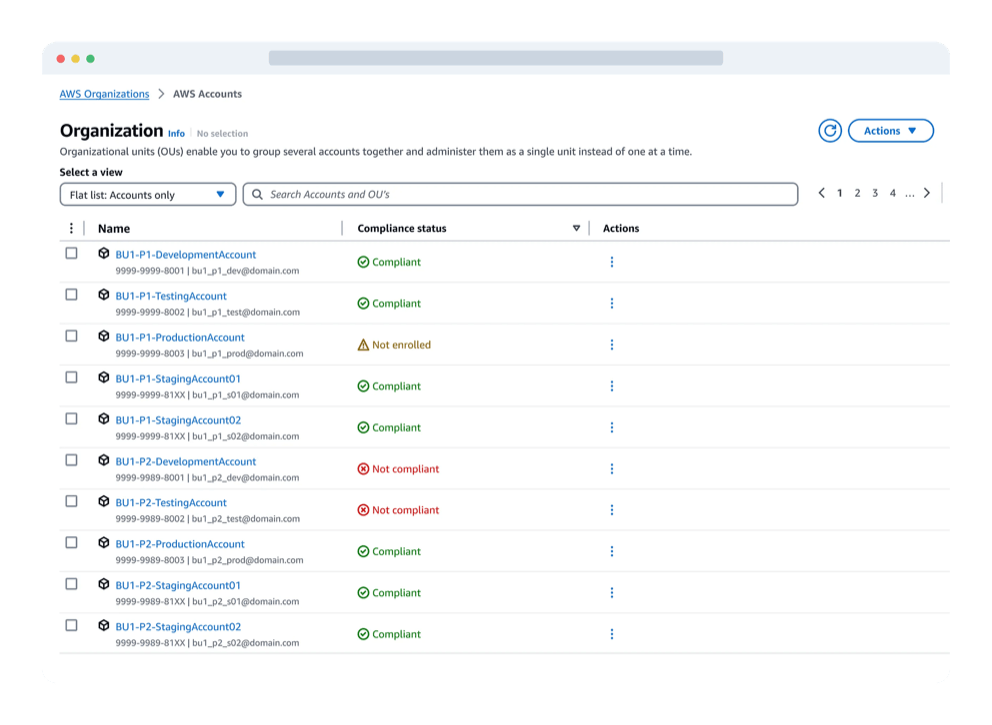
This allowed Control Tower to add compliance information without rebuilding account navigation, and gave future services the same extension point for their own data. The component remained consistent even when the workflow around it changed.
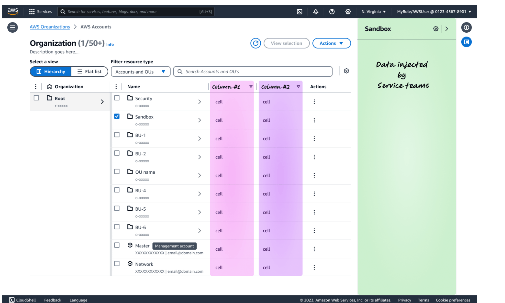
The widget with two service provided metadata columns highlighted in pink and purple, and a split panel open on the right annotated as data injected by service teams.
Service teams add their own columns or open a split panel for more detail on the selected entity.

One system across three footprints

The same component contract could scale from a dedicated Organizations page to an embedded workflow or compact account picker. The amount of interface changed, but the hierarchy, metadata model, and interaction rules stayed consistent.

User Research

Because Miller columns were new to Cloudscape, I tested the interaction before engineering committed to building it. Fifteen customers from large enterprises completed eight tasks covering navigation, view switching, selection, and metadata search.

Drilling in was unfamiliar but learnable. Three of 15 participants could not drill into the hierarchy on their first attempt. Two worked it out later, while one needed moderator help. After the first task, there were no false clicks—evidence that the pattern needed a stronger initial affordance, not a different interaction model.
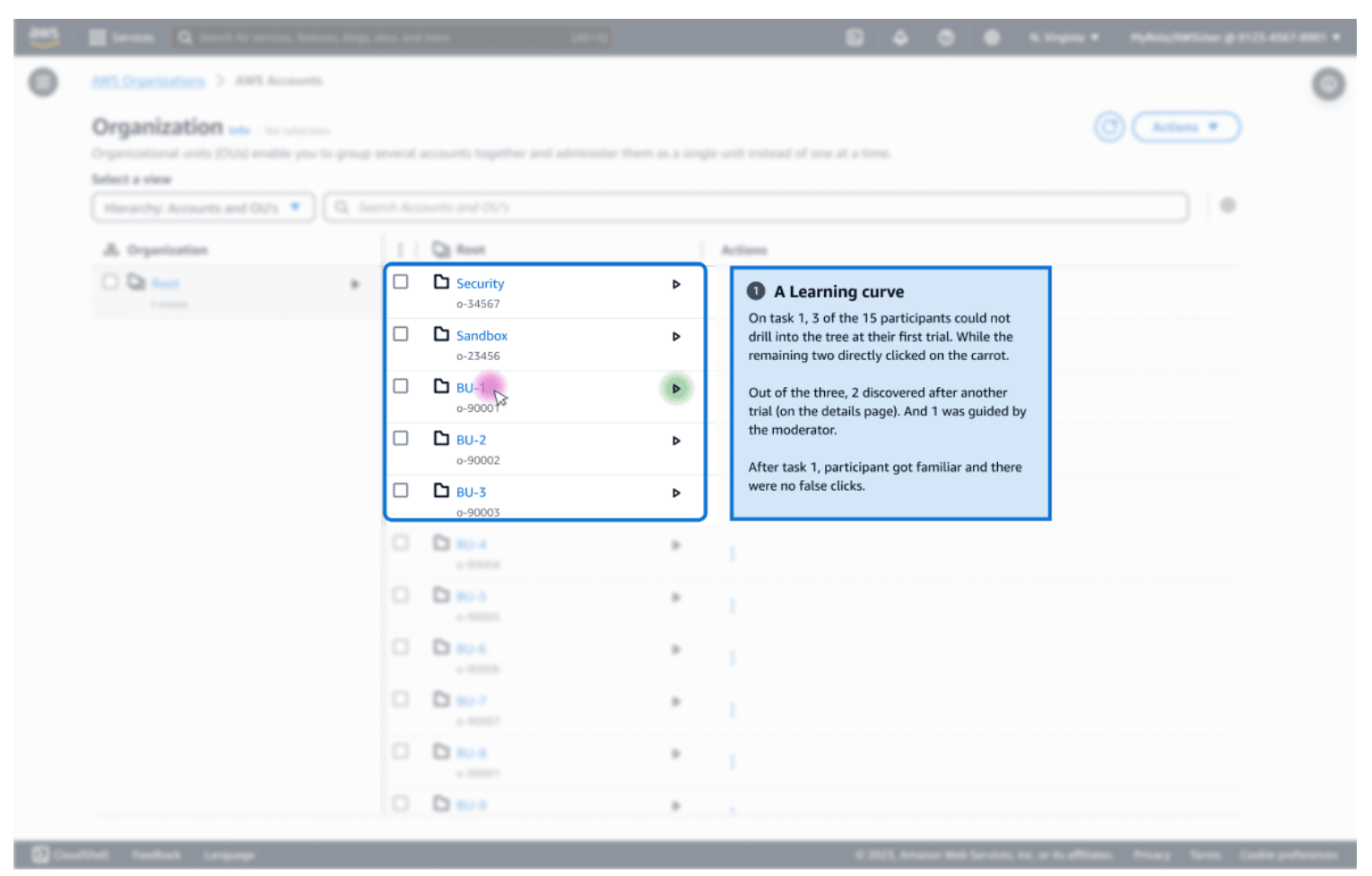
An annotated usability finding on the tree column, noting that 3 of 15 participants could not drill into the tree on their first attempt and that no false clicks followed task 1.
Finding 1: The drill-in interaction had a learning curve that disappeared after one task.

The view switcher was difficult to discover. Two participants missed the flat and hierarchy views during tasks five and six. When opened, the grouped options initially appeared to be duplicates. The finding pointed to greater prominence and clearer grouping.
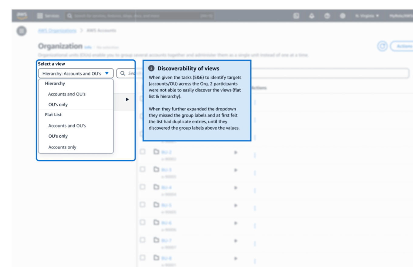
An annotated usability finding on the view dropdown, which lists hierarchy and flat list groups, noting that 2 participants missed the views and read the grouped options as duplicates.
Finding 2: The view switcher was easy to miss, and its groups were difficult to distinguish.

Metadata had to be searchable. Every participant asked to find entities by compliance status and went to the search field first. This confirmed that service-provided metadata needed to power search and filtering, not merely appear beside an entity.
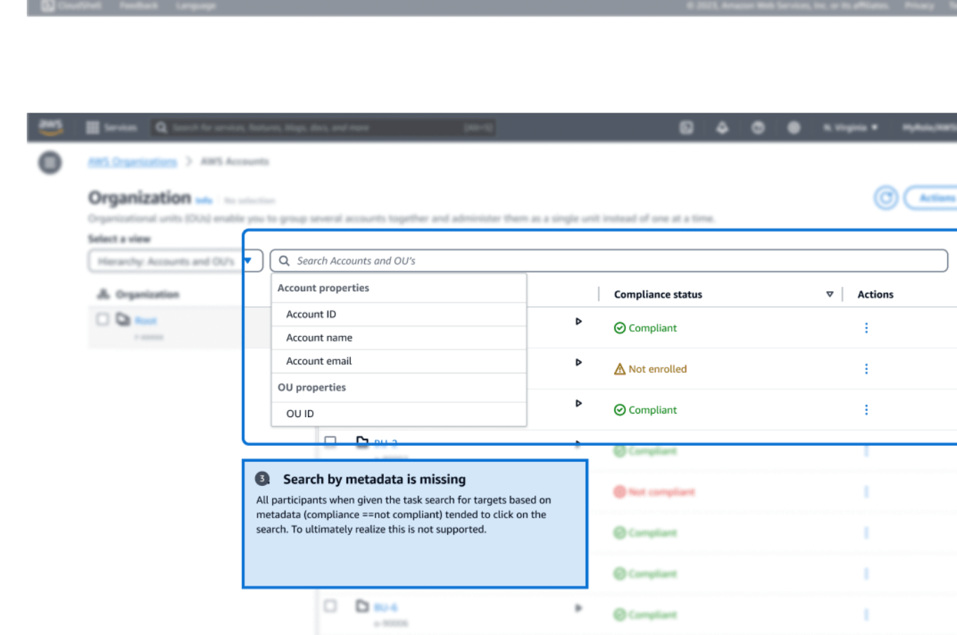
An annotated usability finding on the search field, which offers only account and OU properties, noting that every participant tried to search by compliance status and found it unsupported.
Finding 3: Every participant tried to search using metadata that the existing component could only display.

The study validated the underlying architecture while identifying the interactions that needed refinement: teaching the first drill-in, clarifying the view switcher, and making injected metadata a first-class part of search.

Outcome & Impact

  • 10×Scalability target from 5K to 50K accounts
  • 12AWS service adoption
  • 15Enterprise customers involved in design validation
  • Created one platform contract for varied use cases. AWS Organizations owned hierarchy, navigation, search, and selection, while each service could supply its own metadata and actions without forking the component.
  • Designed enterprise operations for scale. Miller columns, multiple views, metadata search, and nested selection addressed the wayfinding and bulk-management challenges created by 50,000-account organizations.
  • Reduced implementation risk before engineering investment. Eight-task usability testing separated a learnable interaction from genuine discoverability problems, focusing iteration on drill-in cues, the view switcher, and metadata search.
  • Established a reusable adoption model. Large, medium, and small footprints gave future service teams a consistent way to integrate the hierarchy without designing their own account-management experience.